How to Use Customer Logos Without Looking Like a Status Wall
Logos help only when the buyer understands why those customers are relevant.
Proof
Reviews, testimonials, customer logos, numbers, screenshots, and case proof that make a buyer feel safer instead of merely impressed.

Start here
How to tell whether a testimonial is reducing real risk or simply making the page look busy.
Open the guideMore in this shelf
Logos help only when the buyer understands why those customers are relevant.
A case study becomes believable when it shows constraint, process, and result together.
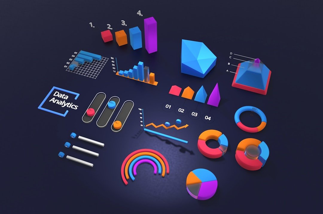
Numbers create trust only when their source and meaning are obvious.
Screenshots can lower doubt when they show process, interface, or reality without leaking private data.
Too little proof feels risky; too much proof can feel like overcompensation.

What should the buyer know before reading this quote?

Can the buyer tell whether the reviews still describe the current offer?

What makes this result useful without making it universal?

What exactly has the client agreed to let you publish?
Adjacent shelves

The quiet fears behind delayed replies, abandoned forms, long consideration windows, and the buyer who keeps asking for more details.

Homepage, landing page, pricing page, about page, FAQ, and contact page trust checks for businesses that need buyers to believe the next step is safe.

Guarantees, trials, refund policies, scope boundaries, onboarding promises, contracts, and reassurance that lowers risk without making fake guarantees.

Weak proof, fake-looking proof, overclaiming, cherry-picked results, vague badges, and trust signals that quietly make a page feel less believable.

Trust signals for consultants, freelancers, agencies, coaches, local service providers, and experts selling judgment rather than a boxed product.